About Cooee
There are currently 750.000 Australians living and working abroad, and 70% of them maintain some form of Australian mobile connection for their first 12 months. However, over the time, this number drops off by 20% for reason of cost and usability. The cheapest pre-paid plans for maintaining phone number require regular upkeep and don’t allow them to make calls or send text messages. Once they lose their phone numbers, it is really hard to get it back from without inconveniencing friends and family at home.
Cooee! is a virtual simcard app that solves the problem of many Australian expats who are overseas but need to keep their mobile phone numbers active for a variety of reasons, such as receiving important OTPs (for paying taxes or mortgages), maintaining contact or relationship with people at home or simply because it’s a good and memorable number.​​​​​​​
The Project
The goal of this project was to design Cooee app from concept to high-fidelity UI/UX. Since Cooee is still in the awareness phase, the client also requested for a marketing website to gather more insights of the target market.
However, later on, Cooee's website needs to be able to accomodate some flows that also exist in the app as well, such as adding new number & porting user's existing number.
Hence, the project deliverables are:
▪ Mobile app design
▪ Marketing website (design & development)
▪ Web app design
This project is a collaboration work with the client (consists of product owner and marketing) and me as the designer.

My Design Process
Before I start, I would analyse the requirements given by the client and when it is due to get the sense of the timeline. Since this was a speedy request within a timeframe of 4 weeks, the client and I decided to base our app design on the target market study done by Cooee's marketing counterpart. 
I also base some flows such as payment, subscription, dialing, messaging, etc., on best practices of ux patterns identified in other similar apps to leverage user's existing mental models.
As for my visual direction, Cooee has already had their logo and brand colors defined, so it made the design process easier by adapting the app & web visuals to their existing identity.

An overview of my design process.

Feature Roadmap
To ensure the Cooee app would be functioning well and serves its purpose, it would require these features:
Account Management
▪ Login and registration (via email and OAuth)
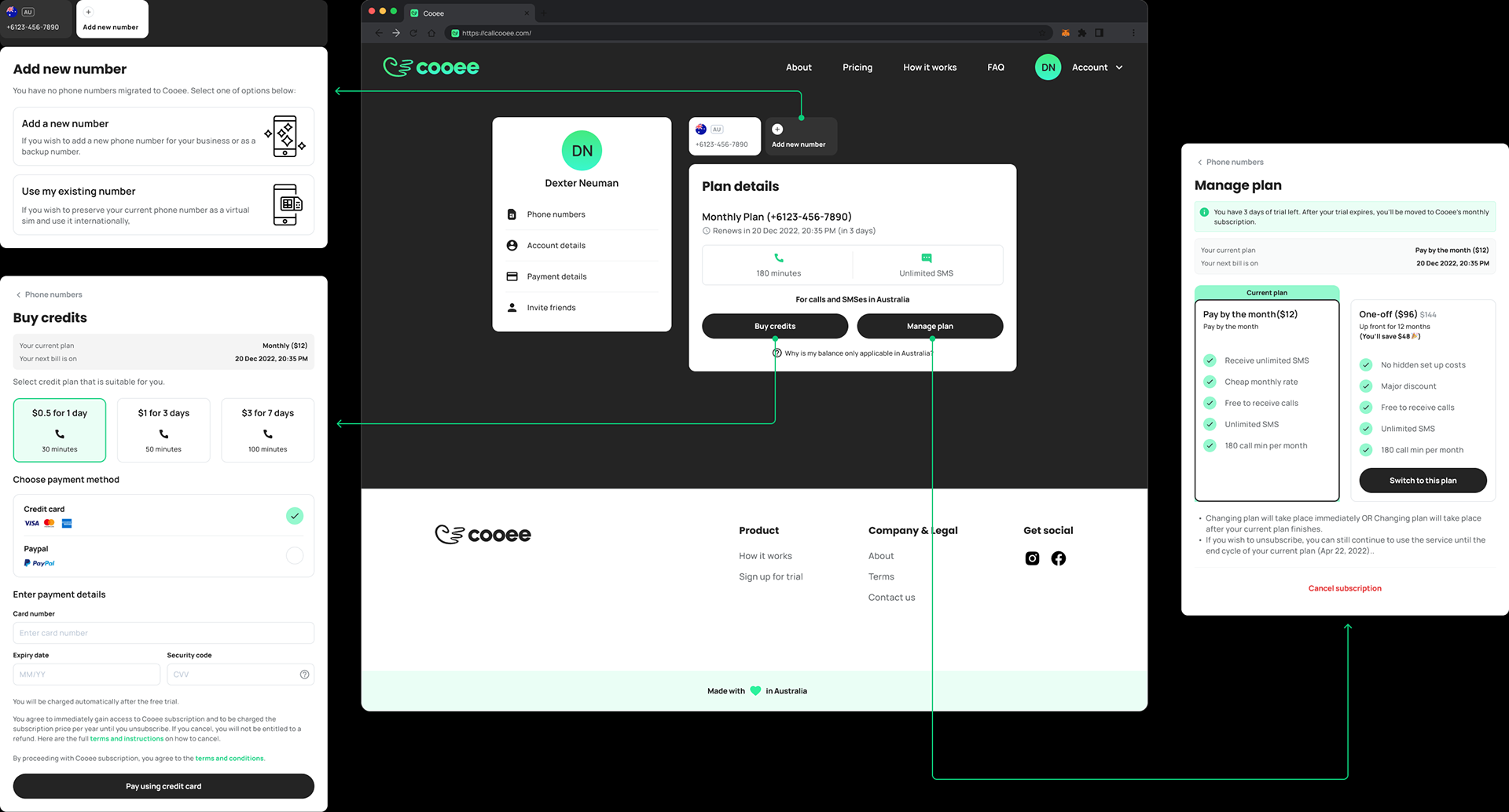
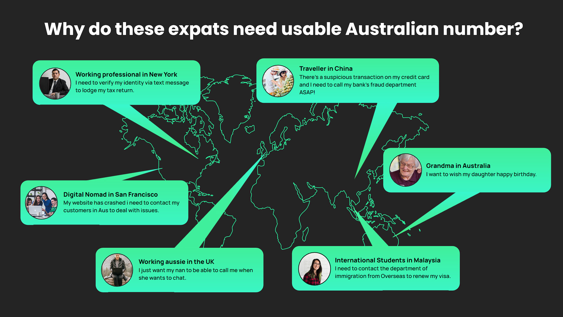
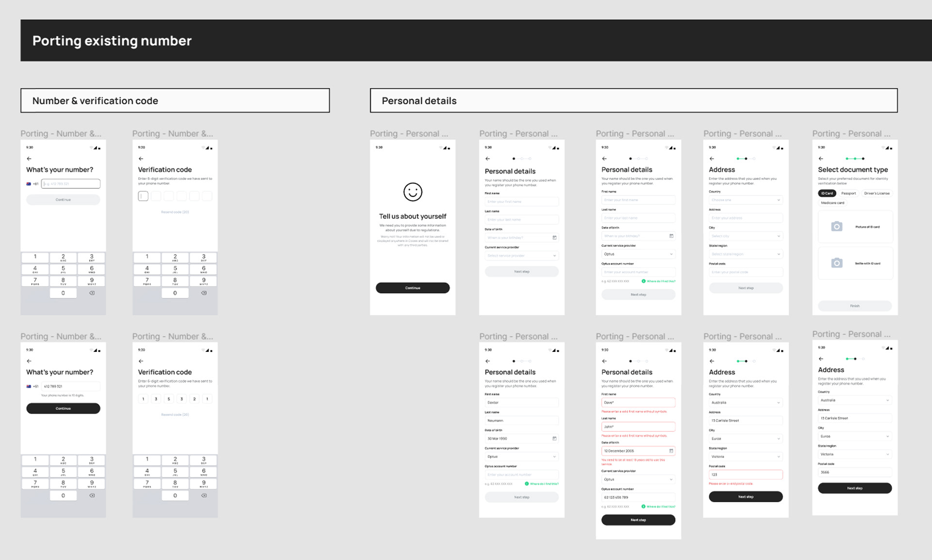
▪ Porting existing number, Adding new number
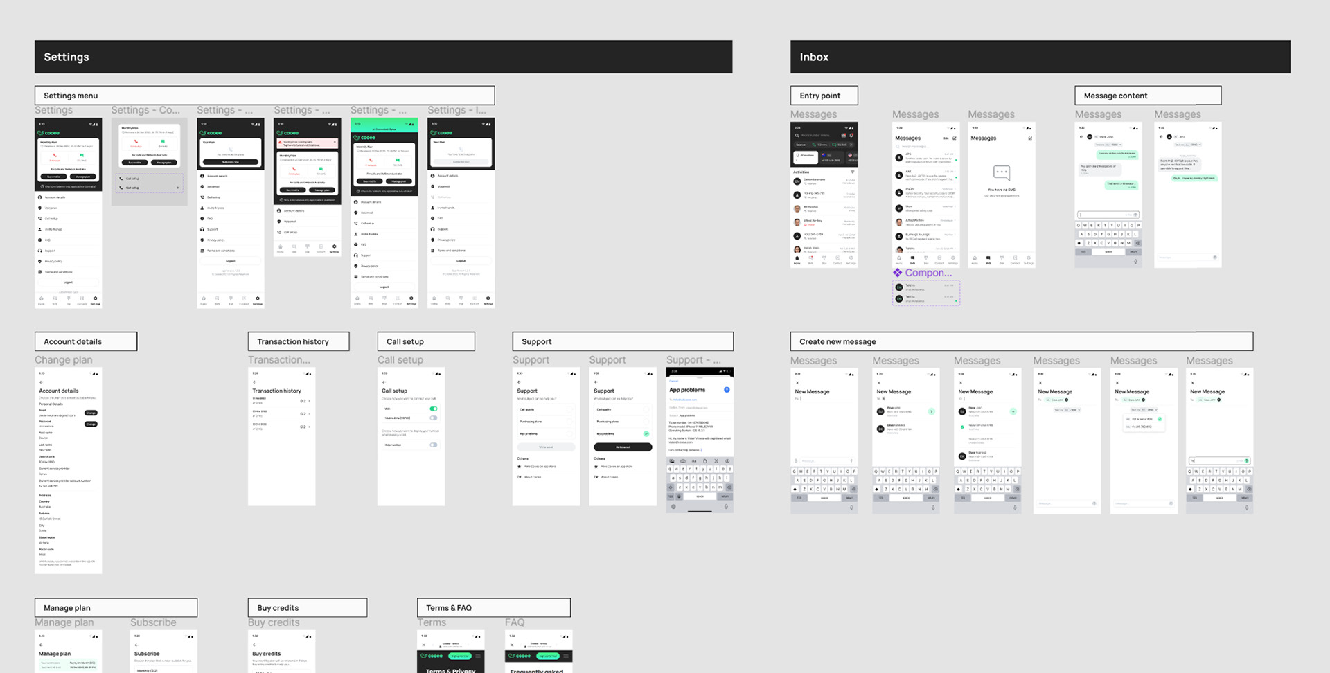
▪ KYC (Know Your Customer) process (since it has to do with an existing sim card provided by external parties)▪ Account and settings
▪ Subscription, credits, and payment
Common Communication Features
▪ Activity (Viewing and filtering outgoing and incoming calls)
▪ Dialpad, SMS, voicemail, etc. (this requires extra attention on the UX since it can handle more than one phone numbers)

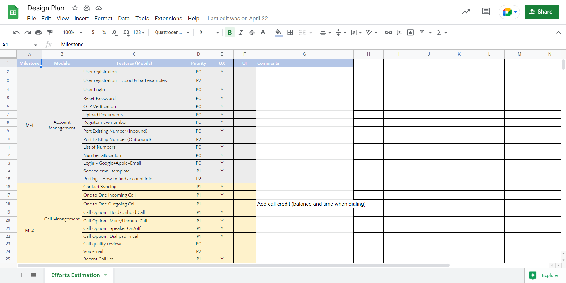
A sheet containing feature and effort estimation list. I am very happy that my client was very detailed and structured.

User Flows
In order to minimize missing links or abrupt user experience, I created user flows that cover how the app would function before I move to the visuals.
I tend to create my user flows in a horizontal swimlane to visually distinguish responsibilities in a business process. This way, I can have an in-depth understanding and to have sense of ownership with the product.

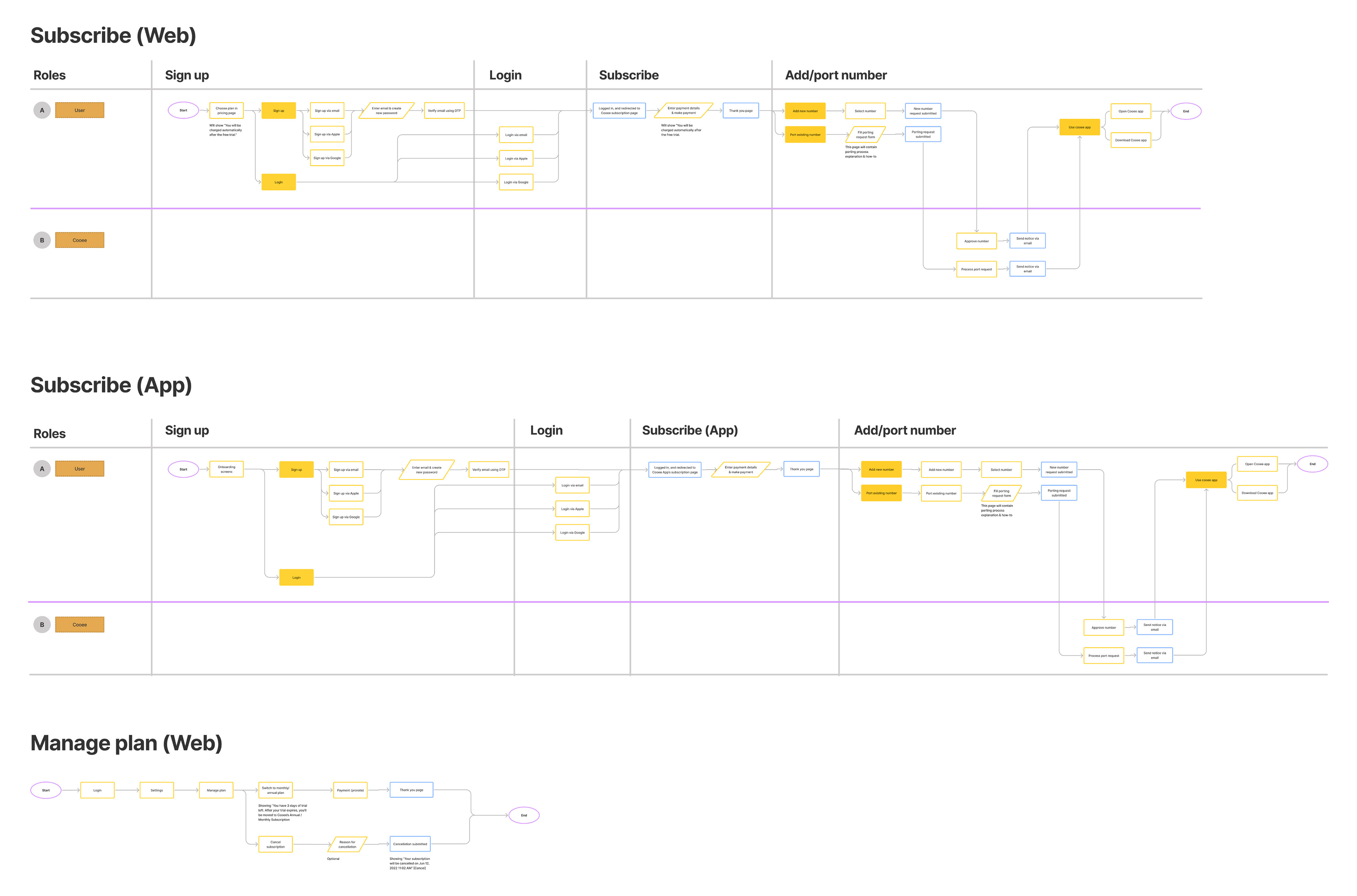
An example of a user flow that I created using Figjam. It covers subscription management for both the app and the web. Feel free to zoom in the image to have a full view of the diagram.

Visuals
After finishing with the wireframe sketches, I move forward to find visual direction that I will apply towards all screens.
The brand guidelines and visual references were provided up-front, and to my surprise, I also have similar ideas towards the approach that they are looking for.
Cooee's design principles are trust and simplicity. I have to ensure that the overall look and feel of the product is satisfying and pleasing to the eye, consistent, and ethical.
I used the Cooee's brand colors as the primary color and derive different shades from it. I also defined colors for success, warning, and error state that have suitable color value with the brand colors.

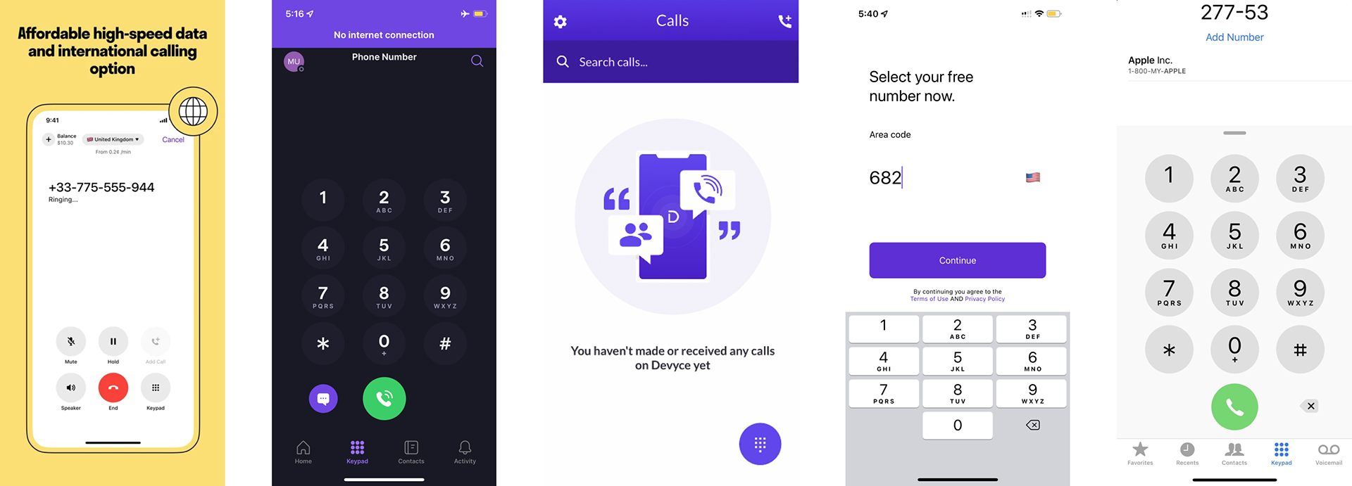
References for Cooee app's look and feel.
Simple, trustworthy, and modern.

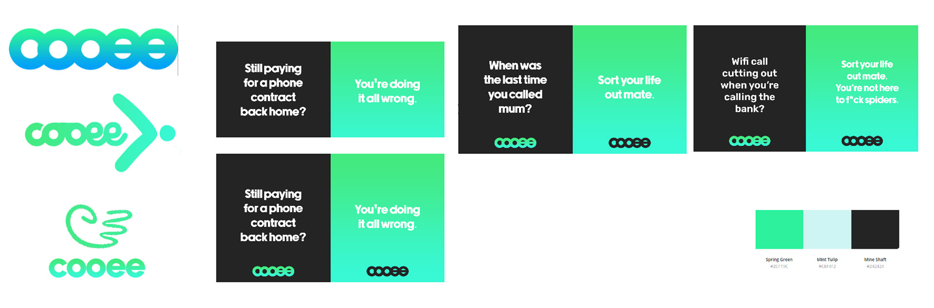
This visual guideline shows the true tone and voice for Cooee's target market, which are Australians.

Then I continue preparing UI components that match Cooee's brand visual style. I also define Manrope, a modern sans serif typeface designed by Michael Sharanda as the main typeface that is going to be used across entire app. 

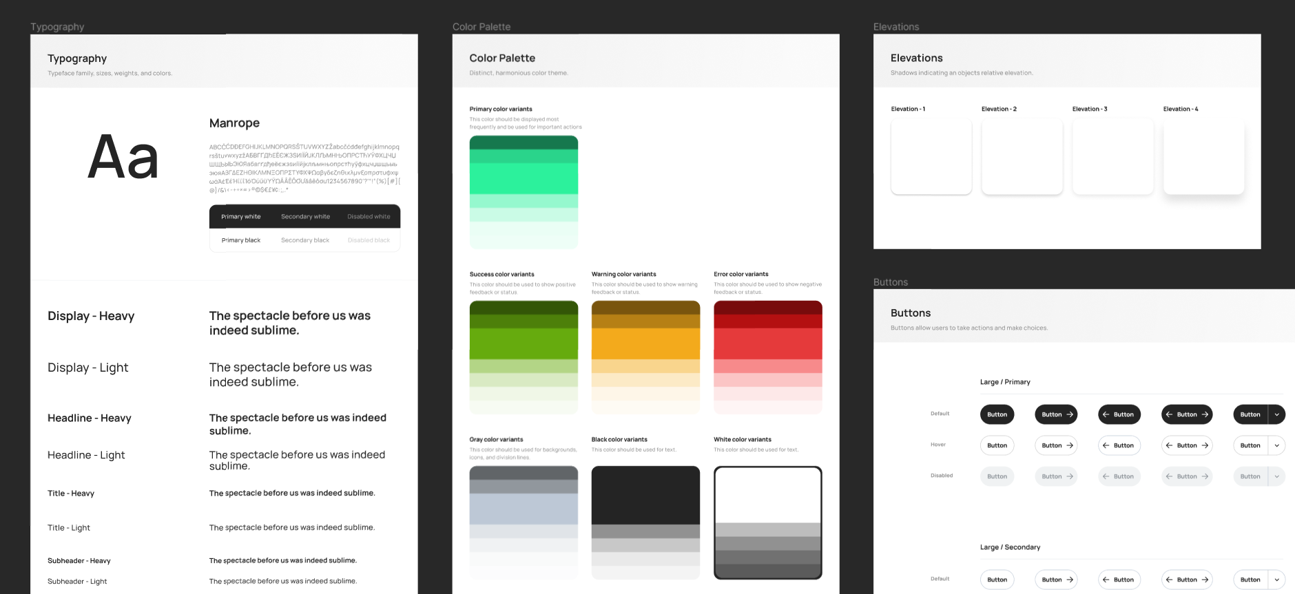
Typography, color palette, elevation, and button design system.

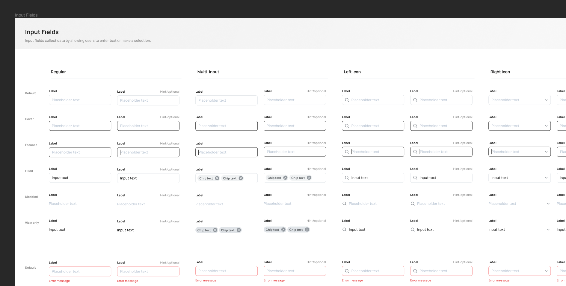
A variation of input fields.

Designs
I design the screens and divide them per flow. After finishing a flow, I would create a simple prototype using Figma's built-in prototype feature. This way, I can self-iterate using my own device and immediately find if there are some missing screens, or if the flow of information is not smooth enough. I'm also using this prototypes to show to the client and developer when I'm giving an overview of the design. 
Designs of some flow in Figma. I use separators to effectively point out different sections of the designs. 
Below is an example of an end-to-end flow from registering, subscription, porting user's existing number, KYC (Know Your Customer), until the porting application is finally approved. This is based on the user flow that I have shown earlier.
After the user has completed the application process successfully, they can start using the communication features in this app.

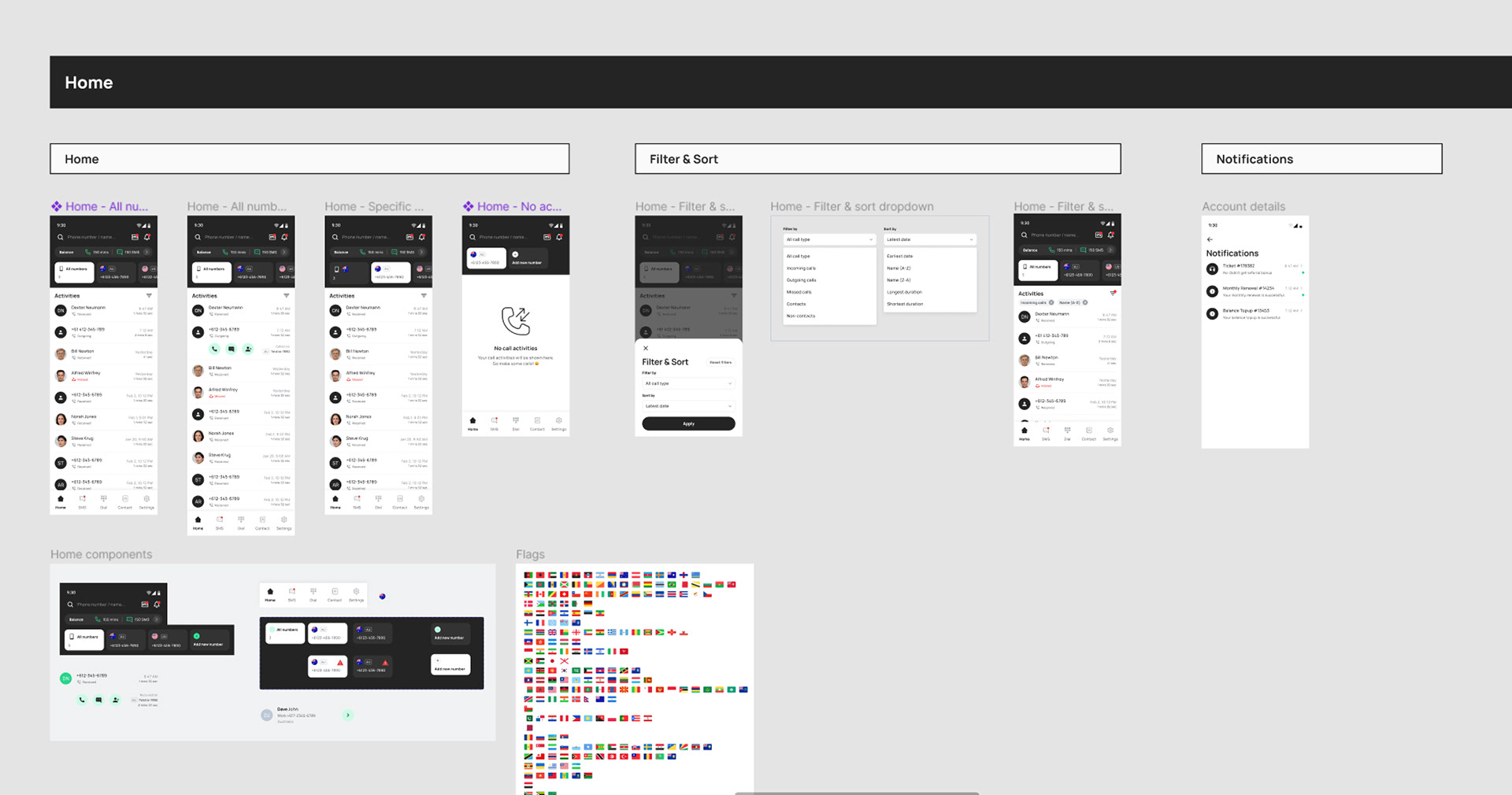
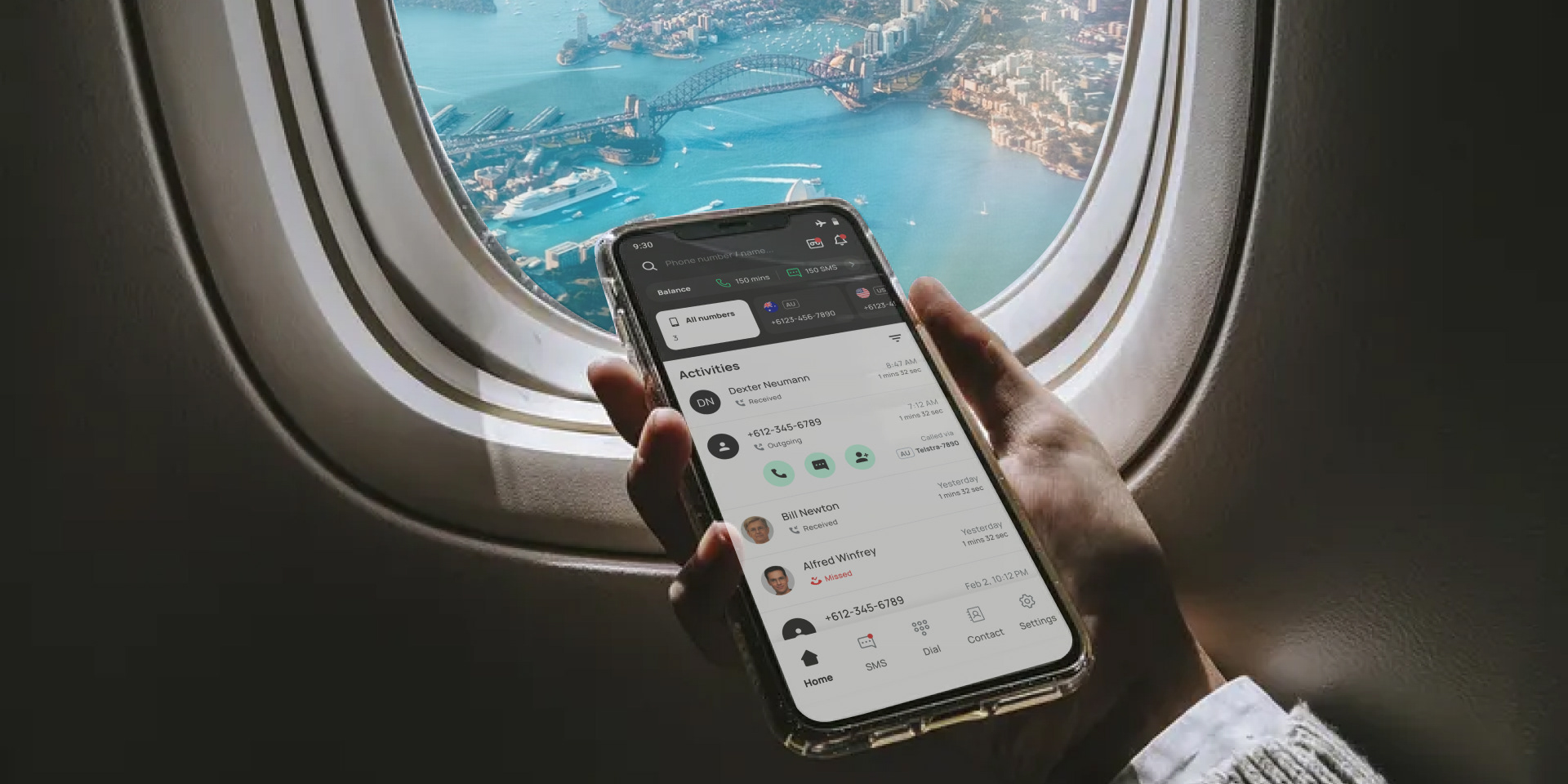
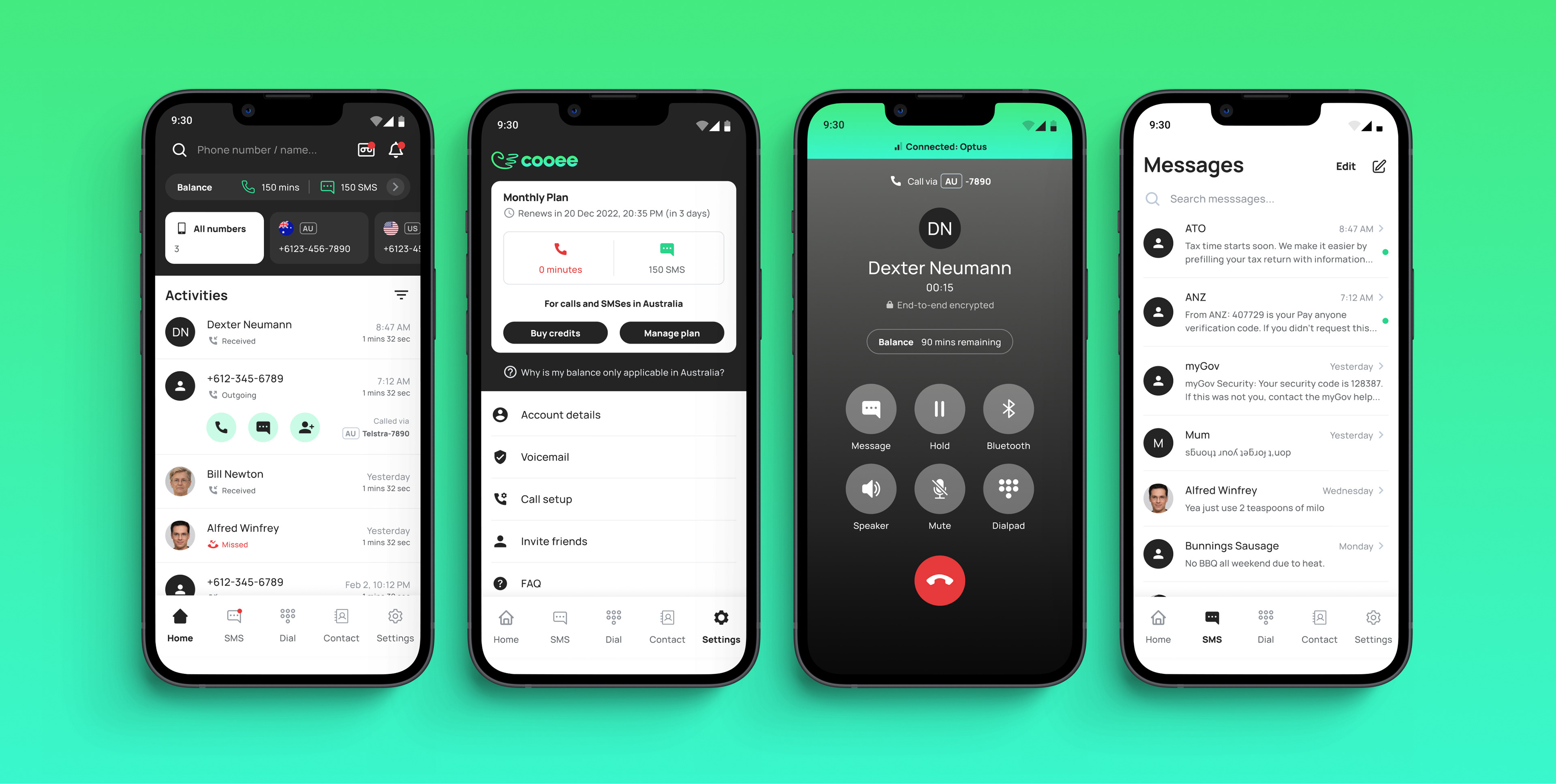
An overview of the app home screen.

A collection of Cooee's app main screens.

Now after all the main screens of the app are finished, I can use them as a material to promote the app in the marketing website. I also created some illustrations that match Cooee's brand visual styles. Then, I created the website using Wordpress and Elementor plugin to speed up the development.

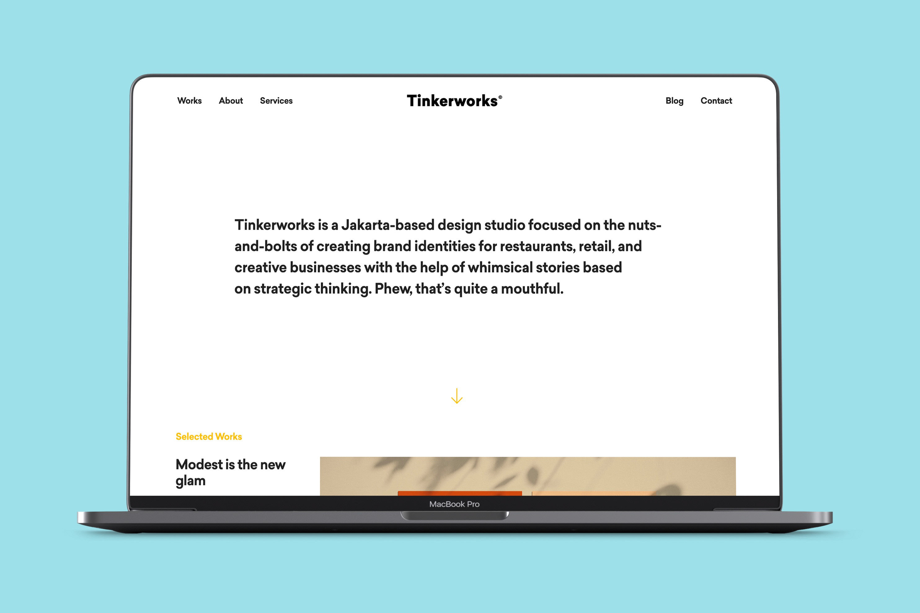
These are some page designs from Cooee marketing website. Notice I used Poppins by Indian Type Foundry as the heading's typeface since it gives more impact on wider screens. 

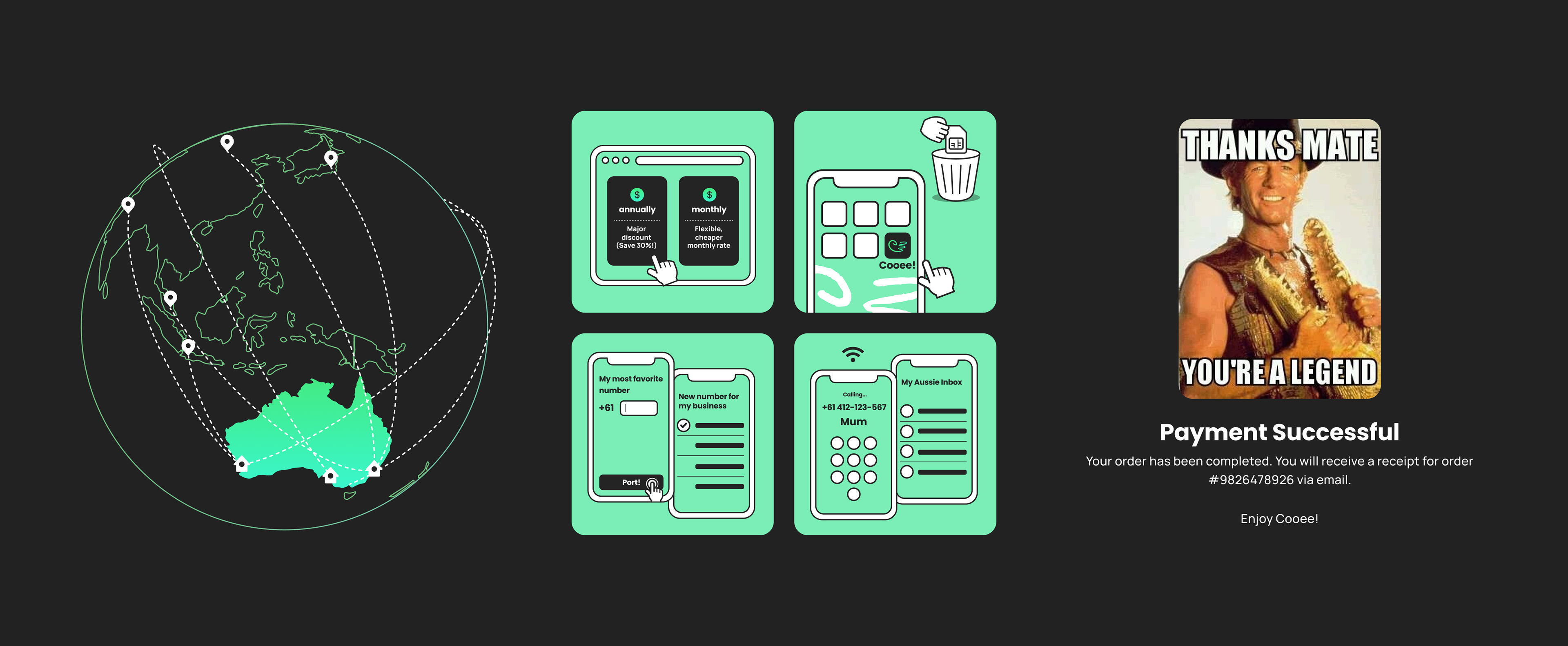
Highlighting the australia continent and using flight lines to show the connectivity to hometown, adding Australian specific slangs like "Mum" and using an Australian meme with its legendary slang "mate" are my attempts to make Cooee appeal to the locals.

I adapted some of the flows that exist in the app to the website as well. Following is an example of an account overview, where user can add new number, buy credits, or manage their plan. These web-app flows are going to be implemented soon in next phase after the app development is finished.
End Note
Working with Cooee was a delightful experience for me since this was my first time designing communications app and developing marketing-first website. If I had the chance to work with them again, it would be very useful to conduct some post-release research in order to gain user insights and measure the impact of the product.
Status: Design finished, ongoing app development.

Visit Cooee's website

You may also like

Back to Top